
Introduction:
If you’re tired of confusing task flows with wireflows, you’ve come to the right place. We’re covering five main UX flow types. We’ll go over their use cases and high-level examples to clear up the confusion surrounding them.
What are UX Flows?
The purpose of UX flows is to map the interaction points of a product or service. We’re not worried about mapping the users’ paint points and thought processes during this stage. UX flows are, however, shaped by the UX mapping and research findings along with the product and development specifications. What should happen when a user performs a specific task? Are they directed to a new page? What about when an error happens? What kind of feedback should the user receive? These are the types of questions a UX designer has to consider when designing the different flows.
Depending on which type of UX flow you’re using, you’ll focus on different experiences. For example, in a task flow, you will go through all the interaction points of a specific task. Meanwhile, a flow chart will showcase every option a user could take during their time with the product. The focus on functional design vs visual design will also vary depending on your flow type.
UX Flow Types:
Task Flow
Task flows follow a specific task from start to finish. For example, say a user wants to change their password and they’re already logged in. A task flow would often start at the homepage, and then show each step required to reach their destination. It should also include what happens if a user fails or successfully updates their password. Take a look at the example below.
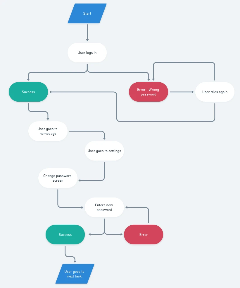
You may have noticed that there aren’t any screen mock-ups in the example. Diagram flows are often used to visualize the journey for a specific task. Why? Because it’s easier to map out the logic and path. Rather than getting caught up in how these pages will look and the messaging used for each state, the focus is on the functional design. The visual can come later after you’ve ironed out requirements.
Creating Task Flows:
You can use a variety of tools to create task flows. The most common is a wireframing app like Whimsical. Any application that lets you create diagrams will work, though. If you’re more of an analog designer, then pen and paper will work. Some designers even use sticky notes and an empty wall.
When deciding what to use, remember to keep collaboration in mind. If the developers or other designers need your task flows, it’s easier to have a digital version.
Flow Chart / User Flow
Depending on who you ask, flow charts and user flows are interchangeable terms for the same UX flow function. Others argue that flow charts are more expansive and cover all the paths a user may take. This means including new sign-ups and existing users. Meanwhile, a user flow does cover all paths a user may take, but they’re generally attached to a specific user persona. For the sake of simplicity, I’m combining both.
Since flow charts and user flows follow every task that a user may take, you’re essentially combining all your task flows. Let’s take the recipe app as an example. A flow chart would start with a user coming to sign up or log in. If they sign up and receive a success state, they’ll move to the login path. From there, every path a user could take is included. See below for a simplified version using the recipe app as an example.

Again you’ll notice that these ux flows are diagrams rather than screens. Since we’re still in the functional design mode and ironing out the logic, we don’t want to get caught up on colors or alignment. You’ll also notice that despite being incomplete, it’s already much more complex.
Creating Flow Chart / User Flow:
Since flow charts are less about visual design and more about functionality, a wire-frame tool like Whimsical would serve you well. Any diagram tool would work though.
As these types of flows are much larger than task flows, it’s not as feasible to map out a full flow chart on a standard wall. But, if you have the space and work better with sticky notes, then that’s an option.
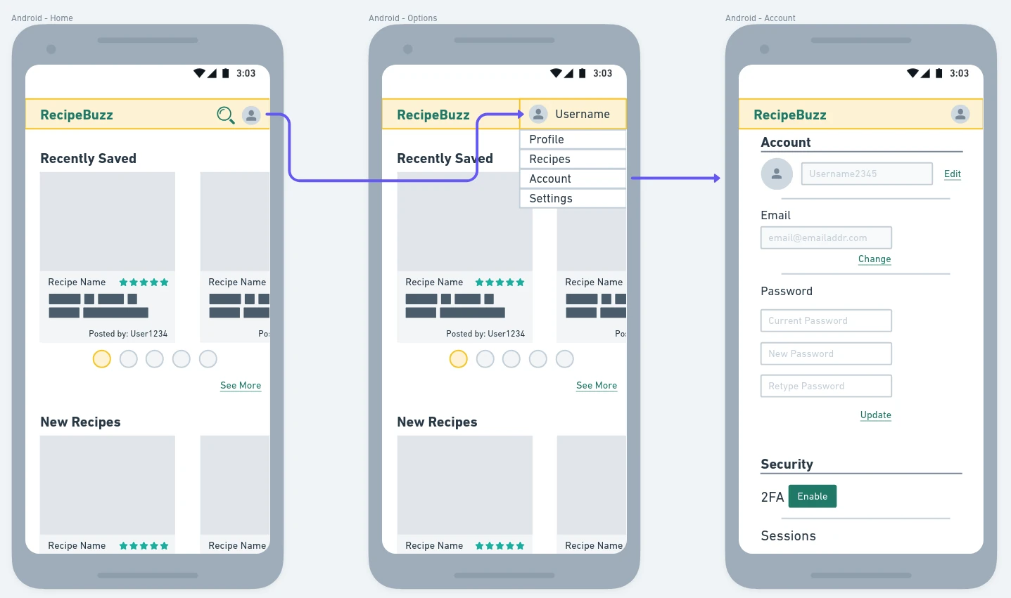
Wireflow:
Wireflows are similar to task flows, but they show low-fidelity forms of the screen in a mock-up. This is often a basic cell phone or browser frame that holds the rough version layouts. This is where visual design starts to combine with the functional design. The content and layout aren’t final, but the purpose of this UX flow is to get the product closer to that final stage.
See below for an example featuring a few low-fidelity screens of a recipe app.
Creating Wireflows:
Much like task flows, you can start with pen and paper if that’s your preferred method. All you’re worried about is capturing your interaction points and a rough idea of what the page will look like. Can a modal window accomplish what’s needed or is it better to direct the user to a new page? Where should the error message appear?
As for software, wireframing tools like Whimsical or Balsamiq are good options. You can also use a UI design-focused tool like Figma.
Screen Flow:
Screen flows are high-fidelity versions of wireflows. Both showcase the interaction journey through screen mock-ups. It’s not uncommon to include prototypes at this level. These flows are often presented to clients and shareholders since it’s closer to the final deliverable.
Below is an example of a few screens using the recipe app.

Creating Screen Flows:
Since screen flows showcase the visual design, you’ll want to use something like Figma that’s meant for UI design. Depending on the expected deliverable, you may want to use a tool that can create prototypes.
While prototypes aren’t mandatory for this UX flow, it can be helpful to see the interaction live. Now, a prototype feature may not be necessary if you know a little bit about the web design holy trinity: HTML, CSS, & JavaScript.
Onboarding Flow
You may have heard this one in reference to both email marketing and web apps. They serve the same purpose which is to welcome the user and ensure they know how to use the product/service. What’s the difference?
An email onboarding sequence happens after a user signs up for an account. Users receive a welcome message and then a series of emails that contain helpful resources, social proof, and similar content.
Web, or on-site, onboarding is usually shorter and happens during the initial sign-up. It’s often the first thing to greet a user after a successful signup.
An example of a web onboarding flow is Duolingo. When you first sign up their mascot, Duo, will walk you through creating your account and starting your first language lesson.
Meanwhile, email onboarding keeps the user engaged for longer. There are no hard rules that say your email sequence has to be five emails exactly and last for two weeks only.
A dedicated email marketer, or someone else in the creative department, often handles the email onboarding. As a UX designer, you’re unlikely to create the email flow. The email process is just as crucial though, so it’s good to understand the UX principles behind it. That’s why I’ve left it in this post, despite not being a traditional UX flow.
How to create onboarding flow:
For on-site onboarding, you’ll want something like Whimsical or Figma to create the screen flows. Developers will need to know what actions should happen after each interaction point.
Your email onboarding can start in a simple Word document. Create the touchpoints, the email content, and when each email should blast. After, you can move to your email design tool. The final step for creating your onboarding flow is implementing the design and automation flow in your ESP (email service provider) of choice.
Summary:
- Task flows show a specific task a user may take, including error and completion states. It uses diagram charts rather than screens.
- Flow charts, also called user flows, map all the paths users may take while interacting with the product/service. Similar to task flows, this UX flow uses diagram charts.
- Wireflows are low-fidelity screen mock-ups that show the interaction points at a page level. The content and design are not final but provide a better visual sense of what the user will see and what developers need to deliver.
- Screen flows are high-fidelity screen mock-ups. Instead of page structure and layout, they show the final design. Simple prototypes are often included.
Which UX flow you start with depends on the project stage and time constraints. Starting with task flows or wireflows is a good option though. In ideal circumstances, you’d be able to complete every step in the UX process as needed. It rarely works that way and you’ll need to prioritize. It’s crucial to start with wireframes before diving too far into the design. If new requirements make an appearance, they’re easier to correct during the earlier stages.
For more design resources, don’t forget to check out other articles from our blog.